
Case study · Brand identity
A brand built to move medicine.
MAP International gets medicine to people in 100 countries. Its brand looked like it was standing still. digifora rebuilt the voice and the visual identity so the brand moves with the same urgency as the mission.
01 · The client
Everybody gets sick. Not everybody gets medicine.
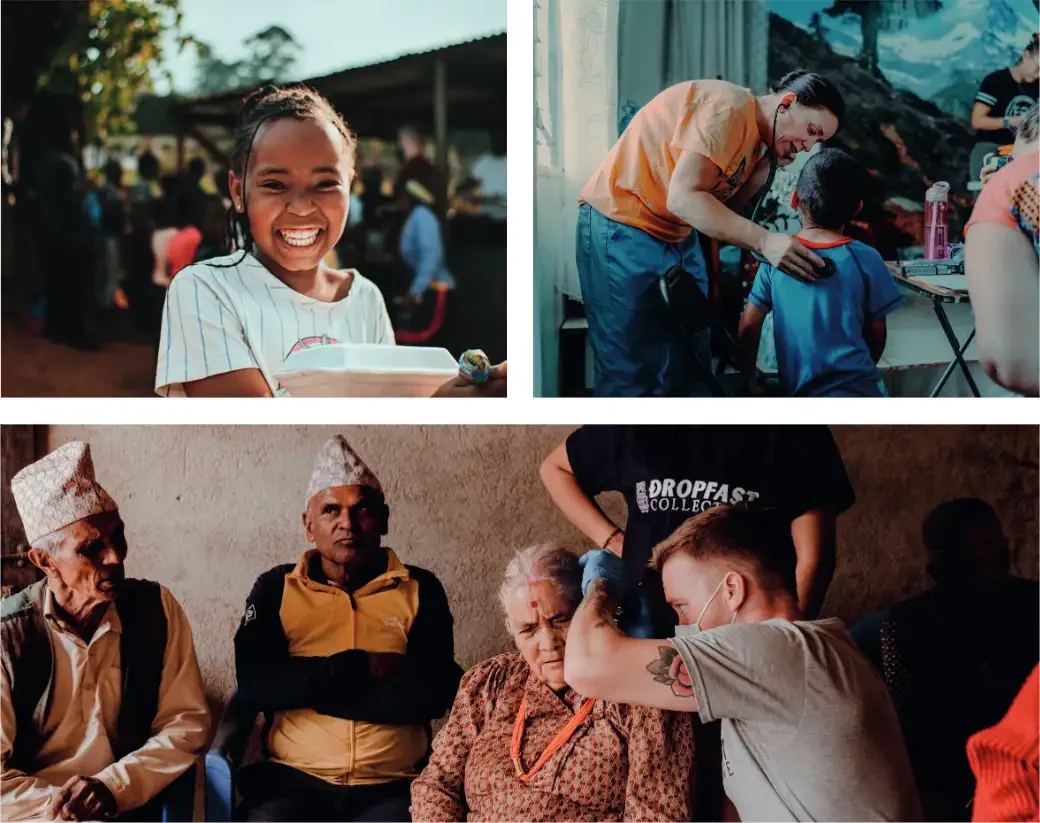
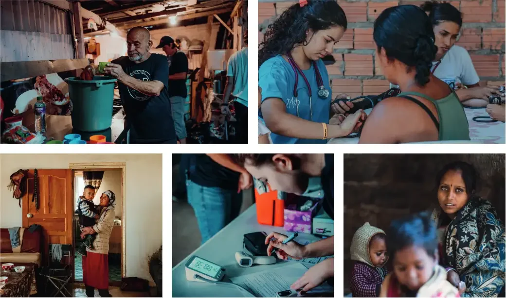
That line is MAP International's reason for being. MAP moves donated medicine and health supplies to people who would otherwise go without, through disaster response, partner hospitals and clinics around the world.
The work is logistics at global scale, driven by faith and by urgency. The brand needed to say both.
MAP International's reported 2025 impact, from map.org.
02 · The challenge
A mission that moves fast. A mark that stood still.
The mark looked dated
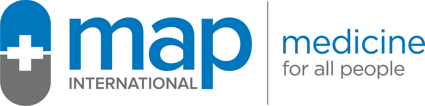
The previous logo, a soft pill and a lowercase wordmark in blue and grey, read like a pharmacy. It said nothing about speed, reach or the people MAP serves.
The experience felt disjointed
In our onsite SWOT, MAP's own team named "inconsistency" and a "disjointed donor experience" as weaknesses. Every team was telling the story a little differently.
The brief: logistics, urgency, motion
Leadership asked us to move away from the dated mark and capture what MAP actually does: get the right medicine to the right place, fast.
03 · Before and after
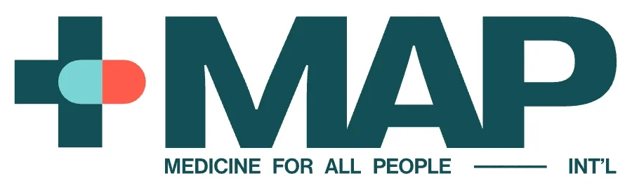
From a pill bottle to a mark that moves.
04 · The process
Listen first. Then design.
We started with listening, not logos. The identity came out of what MAP's people, donors and partners told us.
- 01
Listen
A brand voice survey across MAP's team to find where the story was clear, and where it split.
- 02
Gather in person
A 2-day intensive at MAP's headquarters: SWOT, personas, personality traits and the mission in a single line.
- 03
Define the voice
Tone and copy rules every team can use, from disaster appeals to donor thank-yous.
- 04
Explore
3 concept streams, 2 to 3 iterations each, shown on 6 to 9 real applications. All in black and white, so color could not bias the choice.
- 05
Refine color and type
5 palettes tested for contrast in print and on screen, then the finalists applied to MAP's own campus photography.
- 06
Roll out
A second onsite workshop to plan the rollout, then the brand guide, fonts and every logo file delivered.
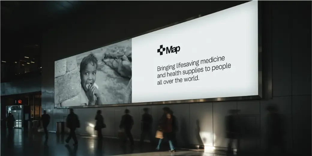
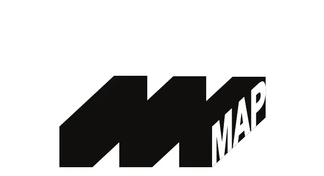
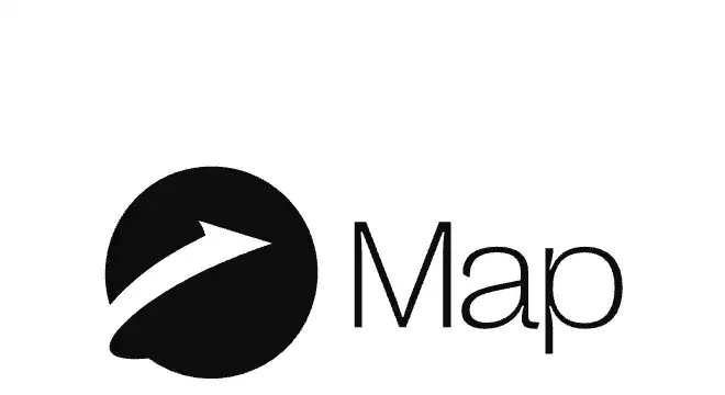
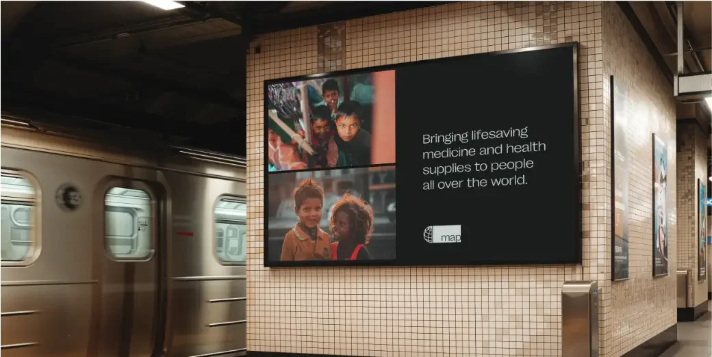
Three concept streams, in black and white
Each idea was shown on real applications before anyone saw a color, so the choice came down to meaning.
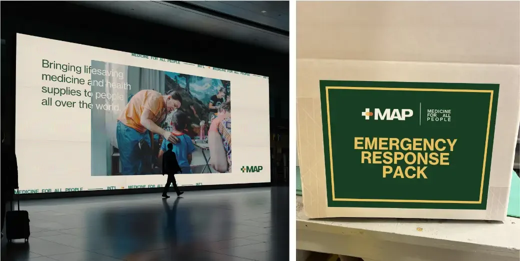
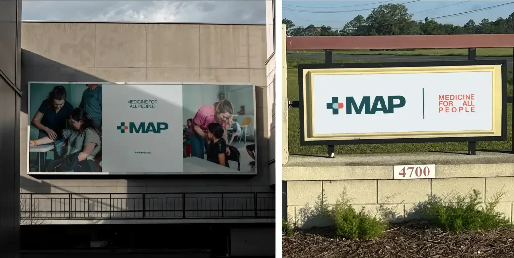
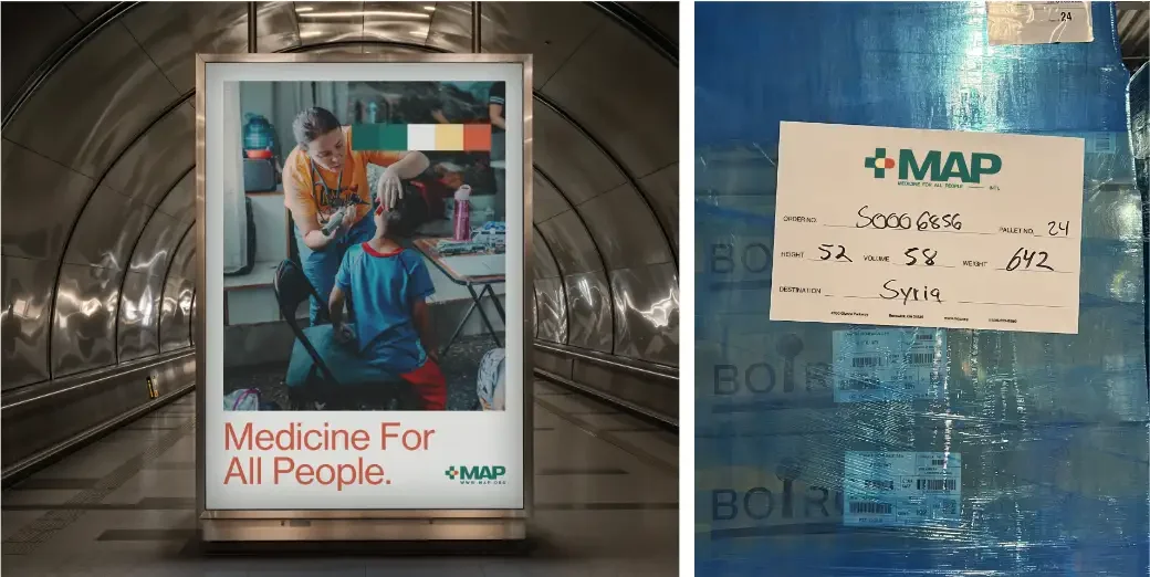
Then color, tested on MAP's own campus
The strongest palettes, each applied to photos of MAP's buildings, signs and shipments before a final choice.
05 · The voice
Sincere. Warm. Transparent. Mature.
MAP is a Caregiver brand: driven by compassion, service and a desire to protect. The team chose these 4 traits together on day one, and every headline, appeal and caption now gets checked against them.
Rooted in genuine care, not performance.
"We do this work because we believe every life matters."
Heart, hope and humility. Never cold or corporate.
"You're part of every life touched by this mission."
Honest about challenges and results. Open hands, open books.
"Here's where your support went, and where it's needed."
Steady, thoughtful and calm in crisis.
"In the face of disaster, we stand ready to serve."
06 · The identity system
Care and delivery, in one mark.
The mark
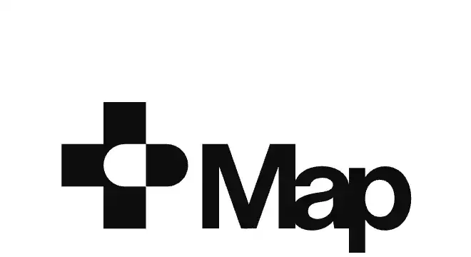
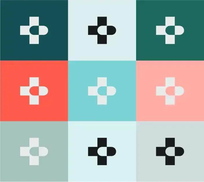
The two most recognized symbols in healthcare, the medical cross and the capsule, merged into one. The cross carries aid, healing and, quietly, MAP's faith. The capsule points right, toward forward movement. And the pill shape keeps a nod to the logo MAP had used for years.
The wordmark
"The use of a bold sans-serif font ensures clarity and authority. Tight spacing and clean cuts of the letters signal efficiency and modernity."
Sam Masih, Executive Creative Director, digifora
Type that travels
PP Right Grotesk for the wordmark and headlines. Neue Haas Grotesk, a modern take on Swiss Helvetica, for everything else. Arial as the system fallback, so partners in 100 countries can stay on brand without installing a single font.
The palette
Midnight Green#075056 · Primary
Vermilion#EF5448 · Primary
Non Photo Blue#8DCBD3 · Primary
Caribbean Green#01655C · Secondary
Alice Blue#E4EEF0 · Secondary
Soft Black#232323 · Secondary
07 · In the world
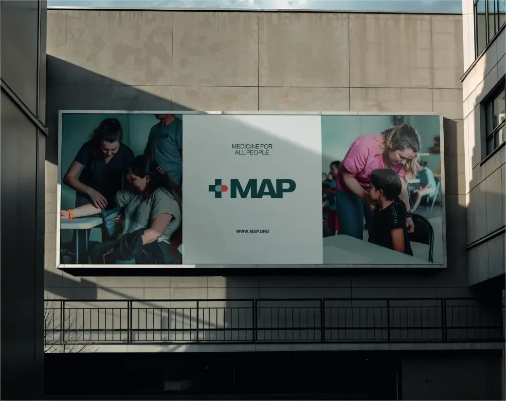
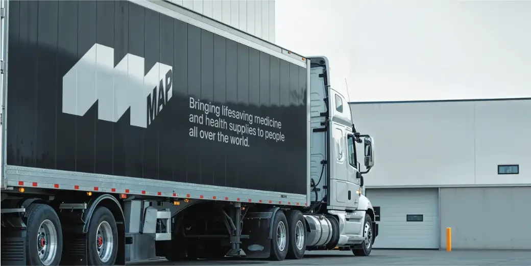
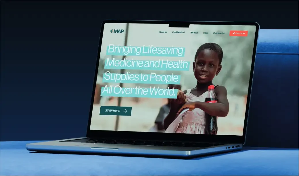
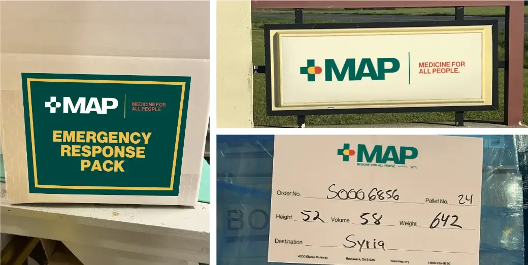
Built for a shipping label, a website and a city street.
08 · Recognition
Two Silver Davey Awards.
The Davey Awards honor outstanding creative work from smaller agencies. The MAP brand refresh took Silver in two categories at the 2026 awards.
View our winning entry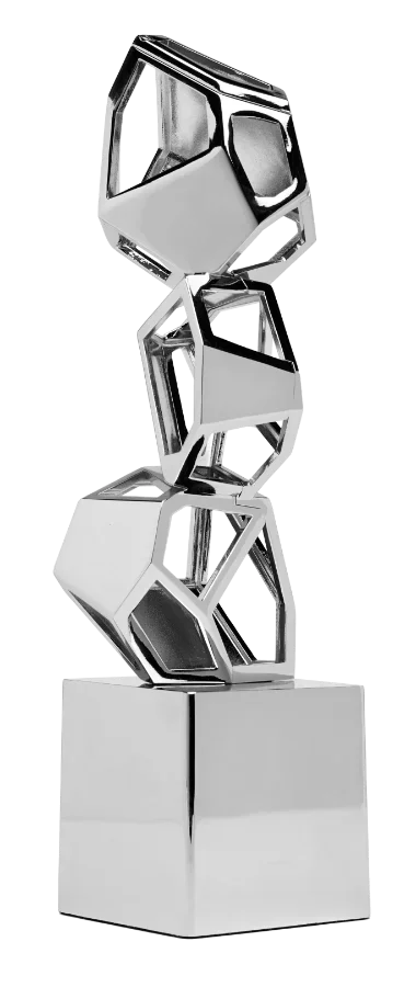
digifora team
- Justin Brackett, Founder
- Jeremiah Gregory, VP, Analytics and Paid Media
- Sam Masih, Executive Creative Director
MAP International team
- Blake Silverstrom, Chief Development and Marketing Officer
- Janice Bryant, VP, Marketing, Communications and PR
- Bailey V. Hanson, Philanthropy Officer
Deliverables
- Discovery survey and personas
- Brand voice guidelines
- Logo system and icon
- Palette and typography
- Brand guide and asset library
- 2 onsite workshops
Is your brand keeping up with your mission?
We will tell you what is working, what is not, and what a refresh would take.